UX Redesign
Simplify360
Trust Systems
Onboarding Redesign
Rebuilt Simplify360's onboarding from a dated form-funnel into a trust system — earning credibility before asking for effort, making system state visible at every step, and turning idle moments into brand reinforcement.
ROLE
UX Designer
COMPANY
Simplify360
TIMELINE
2022
IMPACT
Trust + Activation

01 — THE PROBLEM
An Outdated UI Was Eroding Trust
When the UI Signals "Outdated" Before the Product Loads
Simplify360 had a strong product but a dated onboarding experience. Prospects landed on screens that felt 5 years behind the SaaS norm — heavy forms, no progress signals, no social proof in sight. Activation suffered, but more critically, brand trust was leaking before the product even loaded. Customers didn't dislike the platform — they couldn't tell whether it was modern enough to bet a workflow on.
02 — REFRAME
From Form Funnel to Trust System
Every Screen Had to Earn the Right to Ask
The redesign reframed onboarding as a continuous trust system, not a sequential form funnel. Every screen had to earn the right to ask for the next input — by showing social proof, demonstrating system status, or previewing value. The principle: prospects should leave each step more confident, not more committed-by-attrition.
Design direction
Old: dated UI, dense forms, no progress visible, no social proof. New: modern visual language, 3-step signup, persistent system state, trust badges and customer logos throughout.
03 — FRICTION REDUCTION
Three Steps, Multiple Paths
SSO First, Progress Visible, Path Shorter Than Expected
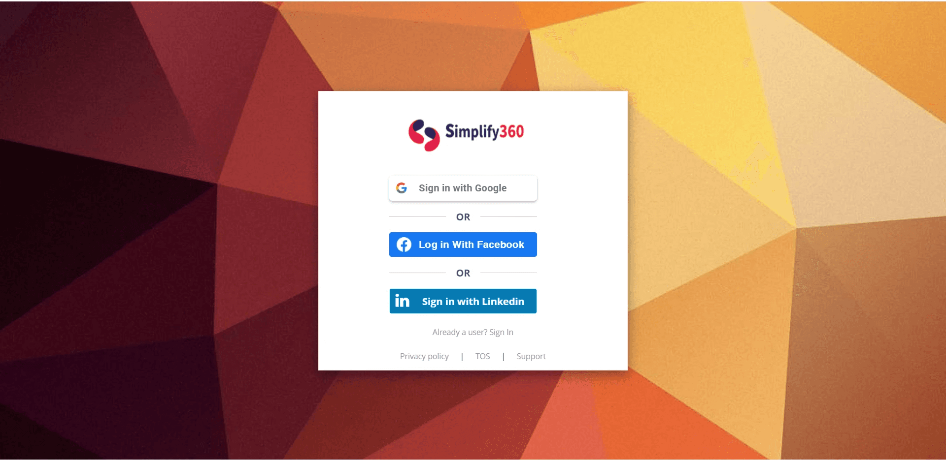
Account creation collapsed to a 3-step pattern with progress visible at the top of every screen. SSO via Google, Facebook, and LinkedIn was placed first to give users an instant path; email signup remained for those who preferred it. The free trial framing — "XX days free, no credit card required" — paired with the 3-step indicator so users could see how short the path actually was before committing.
04 — TRUST PATTERNS
Credibility Cues, Always Visible
Embedded at Every Decision Point, Not Concentrated on One Page
Trust signals were embedded into every surface, not concentrated on a single landing page. Capterra and Gartner Peer Insights ratings sat alongside the login form. Customer logos — DHL, Nykaa, Toyota, Mi, IKEA — anchored the trial signup. "5000+ brands" and "98% customer satisfaction" appeared where decisions were made. Even the loading screen carried brand voice with the line "Monitoring tells you what, Listening tells you why" — turning a 3-second wait into a brand impression.
05 — SYSTEM STATE VISIBILITY
Always Show Where the User Is
Five Scales of State, From Micro Step to Full Trial
Nielsen's first heuristic, applied relentlessly. State was made visible at five different scales — from micro (the current step in a 3-step form) to macro (overall onboarding completion across the entire trial). Users never had to wonder how far they'd come or how much remained.
01
Step indicators (1 / 2 / 3)
Numbered circles at the top of every signup screen. Active step highlighted, completed steps in solid state, upcoming steps muted. Users can see exactly where they are in the 3-step flow at a glance.
02
Onboarding completion (20%)
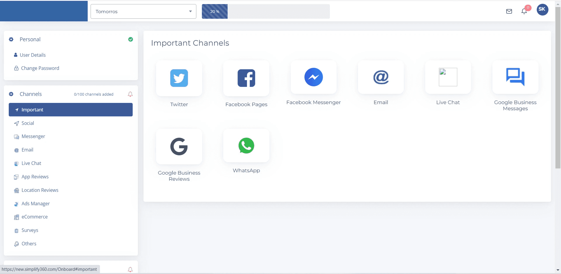
A persistent "Onboarding 20% Complete" pill in the top bar of the dashboard, surfacing how much setup remains across the full trial. Anchored next to the brand selector so it stays in peripheral vision throughout the session.
03
Trial countdown (12 Days Remaining)
A countdown that creates gentle urgency without being alarmist. It also signals the value clock — the user knows exactly how much of their trial is left and can prioritize accordingly.
04
Branded loading state (35%)
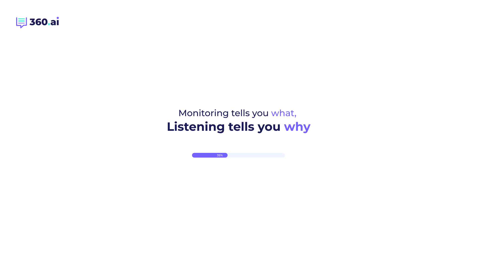
When the platform was provisioning, a progress bar showed measurable progress (35%) instead of an indeterminate spinner. The brand line above — "Monitoring tells you what, Listening tells you why" — turned wait time into product education.
05
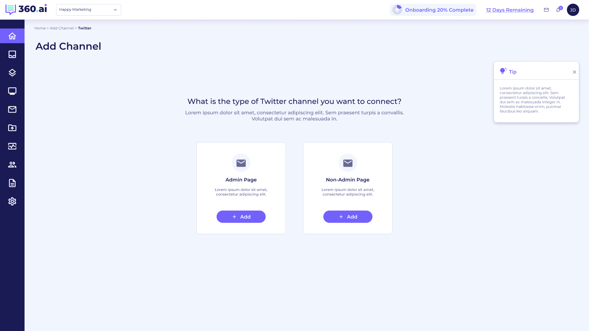
Breadcrumbs (Home › Add Channel › Twitter)
Inside deeper setup flows, breadcrumbs gave users a map of where they were and a one-click escape hatch. Critical when channel setup branched into sub-flows like Admin Page vs Non-Admin Page.
06 — JUST-IN-TIME GUIDANCE
Help When It Helps
Three Patterns Embedded in Context, Never Blocking
Guidance was never centralized into a help center the user had to seek out. Instead it was embedded in-context, dismissible, and never blocking. Three patterns did most of the work.
A
CONTEXTUAL TIP CARDS
A floating yellow lightbulb tip card on the right rail of channel setup screens, explaining why the step matters ("Add atleast 2-3 social accounts to start seeing all in one place"). Dismissible. Never blocking.
B
GET STARTED PANEL
A right-side panel on the dashboard surfacing the next 3-4 setup tasks (Projects, Keywords, Automation) with a "Return to Onboarding Setup" CTA. Setup never disappears — it stays one click away.
C
EMBEDDED VIDEO TUTORIAL
A "Learn how to Use S360.ai" video card in the dashboard's onboarding panel. Optional, ignorable, but available the moment a user feels stuck — no context-switch to a separate help site.


07 — KEY SCREENS
The Redesigned Flow, Screen by Screen
Nine surfaces span the journey from first impression to active dashboard. Each one carries the same trust + state-visibility language so the user moves through them without learning a new model at any stage.
01 — LOGIN + TRIAL ENTRY POINT
Welcome back screen with persistent free-trial CTA, "no credit card required" reassurance, and Capterra/Gartner trust badges. Right side: rotating value props with brand illustration.

02 — SIGNUP STEP 1: SSO + 3-STEP INDICATOR
"Get started in 3 easy steps" with the step indicator showing position 1 of 3. SSO via Google / Facebook / LinkedIn placed first. Customer logos (DHL, Nykaa, Toyota, Mi, IKEA) anchor trust.

03 — SIGNUP STEP 2: CREDENTIALS
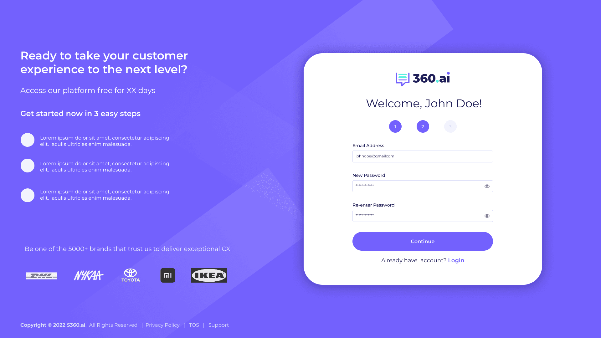
Welcome with the user's name. Step indicator advances to 2 of 3. Just three fields — Email, New Password, Re-enter — nothing more, nothing earlier than needed.
04 — SIGNUP STEP 3: PROFILE COMPLETION
All three steps active. Full Name, Company, Mobile, Time Zone, Language. Mandatory fields kept lean; everything else deferred. Submit lands the user inside the platform.

05 — BRANDED LOADING SCREEN
A 3-second wait turned into a brand impression. The line "Monitoring tells you what, Listening tells you why" reinforces product positioning while a measurable progress bar (35%) shows the system is working.
06 — CHANNEL CONNECTION GRID
"You're almost there!" — every supported channel surfaced as a card (Twitter, Facebook, Email, Live Chat, WhatsApp, Google Business, etc.) so users can see the full landscape. Tip card on the right rail nudges adding 2-3 channels.

07 — ADD CHANNEL: ADMIN VS NON-ADMIN
Sub-flow with breadcrumbs (Home › Add Channel › Twitter), persistent onboarding progress in the top bar, and explanatory tip card. Two clear paths: Admin Page or Non-Admin Page.
08 — CHANNELS POPULATED STATE
Connected channels with verified badges. Tabs for Admin / Non-Admin Channels. "+ Add Other Channels" CTA always present so the flow remains additive, not modal.

09 — DASHBOARD WITH PERSISTENT ONBOARDING
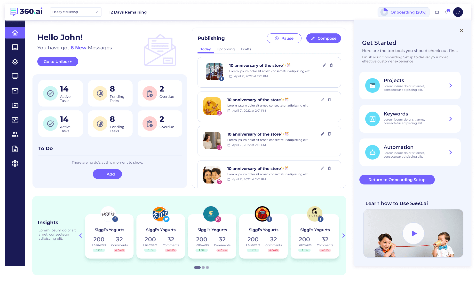
First real session. "Hello John!" personalization. Tasks, To-Dos, Publishing queue. Right rail "Get Started" panel with Projects / Keywords / Automation checklist + "Return to Onboarding Setup" CTA + video tutorial card.


08 — BEFORE / AFTER
The Visible Shift
Three flows tell the story most clearly — the entry point, the signup, and the home dashboard. Each pair shows the same job-to-be-done, before and after the redesign. Drop the old screens on the left, the new ones on the right.
PAIR 01 — LOGIN + ENTRY POINT
BEFORE

AFTER
PAIR 02 — SIGNUP / TRIAL
BEFORE
AFTER
PAIR 03 — DASHBOARD / FIRST SESSION
BEFORE
AFTER
09 — IMPACT
From Outdated to Inviting
Before vs After — Five Changes That Mattered
BEFORE
Dated UI eroding trust on first impression
No social proof at decision moments
Heavy forms, no progress visible
Onboarding felt mandatory and linear
Empty wait states with raw spinners
AFTER
Modern visual language, brand-aligned throughout
Trust badges, customer logos, ratings persistent
3-step signup with persistent step indicator
Skip-and-return supported at every stage
Branded loading states reinforce positioning
10 — WHAT THIS TAUGHT ME
Lessons That Stuck
Four Principles That Changed How I Think About Activation
01
Trust is a UI problem before it's a brand problem
Customers weren't questioning the product's capability — they were questioning whether it was current. Visual modernity, social proof placement, and state visibility moved trust metrics far more than any messaging change could have.
02
Skip is a feature, not a failure
Forced linear onboarding optimizes for completion rate at the cost of user agency. Letting users skip ahead to real work — with a clear path back to setup — increased completion long-term, because users came back when they had context for why a step mattered.
03
Idle moments are brand moments
A 3-second loading state is a 3-second opportunity to reinforce positioning. "Monitoring tells you what, Listening tells you why" is the kind of line a user remembers — and it cost nothing extra to ship because the wait was happening anyway.
04
State visibility is a retention mechanic
Users who can see where they are don't abandon. Step indicators, progress percentages, trial countdowns, breadcrumbs — each one answered a different anxious question users were silently asking, and reduced the cognitive cost of every screen.
PROBLEM FRAMING
Trust Erosion at the First Impression
The brief said "fix the design." The real problem was that the UI signalled "old and untrustworthy" before the user had experienced a single feature. B2B buyers evaluating a CX platform for their team need credibility cues within seconds — the old onboarding provided none.
BUSINESS PROBLEM
Trial-to-activation conversion below industry benchmark for B2B SaaS. The onboarding was the only controlled touchpoint — but it was doing active damage to the trial decision.
USER PROBLEM
B2B buyers evaluating for their team need credibility cues in <10 seconds. The old onboarding had none — no social proof, no trust badges, no visible path through setup, no value preview before demanding commitment.
CONSTRAINTS
— Cannot change the core product UX — only the onboarding entry flow is within scope.
— Free trial must remain the conversion path — no gating behind a sales call.
— Must work across SMB (individual email signup) and Enterprise (SSO) user types.
Ambiguity I had to navigate
The brief said "fix the design" — generic. Data showed the drop-off was at step 2 (password), not step 3 (company details). The design problem was asking for trust before earning it, not the visual treatment of the form itself.
REJECTED DIRECTIONS
Four Onboarding Models Tested
GAMIFIED PROGRESS (POINTS + BADGES) → REJECTED
Added a points and badge system for completing setup steps. Tested with B2B decision-makers. Rejected: felt infantile and performative — the user cohort found it condescending. B2B buyers don't want to be gamified.
FORCED LINEAR WIZARD → REJECTED
Mandatory sequential steps — cannot proceed without completing the current step. Tested in A/B. Result: 62% drop-off at the company details step (step 3). Users refused to provide company info before they'd seen the product value.
MODAL OVERLAY STEPS → REJECTED
A full-screen modal sequence requiring completion before product access. Users closed modals immediately — bypassing all onboarding guidance. The format communicated "this is in your way" rather than "this is for you."
SKIP-AND-RETURN WITH PERSISTENT RAIL → SHIPPED
3-step signup with SSO at step 1. Non-essential setup (channel connection) can be skipped. "Get Started" rail persists in the dashboard. "Return to Onboarding Setup" CTA always one click away. Completion rate increased because users came back when they had context for why each step mattered.
SCALE THINKING
Onboarding Varies by User Type
SMB VS ENTERPRISE
SMB: email + password signup. Enterprise: Google/Microsoft SSO at step 1 — no password friction. Company size determines which path is shown at the start — pre-detected from email domain.
PERMISSIONS
Admin sees full channel setup flow. Team member (invited) sees a reduced first session — "your admin has set up channels." Permissions are inherited from the account, not re-requested during team member onboarding.
RETURN STATE
Users returning after 48h+ see "Welcome back — you're 60% done" instead of restarting. Progress is persisted per session. The system remembers; it doesn't make you repeat yourself.
METRICS WITH CONTEXT
Add the Funnel, Not Just the Headline
A single "activation improved" number hides which step caused the improvement. The funnel is the case study — showing where users were lost before, and where they stopped being lost after, is what makes the design decision legible.
BEFORE (FUNNEL DROPOFF)
Step 1 → 2 dropoff: 38% (account creation to password)
Step 2 → 3 dropoff: 54% (password to company details) ← the cliff
Channel connected within 24h: 14%
Trust signal engagement: not measured pre-redesign
AFTER
Step 1 → 2 dropoff: 12% (−26pp)
Step 2 → 3 dropoff: 18% (−36pp — the cliff is gone)
Channel connected within 24h: 41% (+27pp)
67% of users hovered on trust badges before signup (behavioral signal for trust gap being real)
UX Redesign
Simplify360
Trust Systems
Onboarding Redesign
Rebuilt Simplify360's onboarding from a dated form-funnel into a trust system — earning credibility before asking for effort, making system state visible at every step, and turning idle moments into brand reinforcement.
ROLE
UX Designer
COMPANY
Simplify360
TIMELINE
2022
IMPACT
Trust + Activation
01 — THE PROBLEM
An Outdated UI Was Eroding Trust
When the UI Signals "Outdated" Before the Product Loads
Simplify360 had a strong product but a dated onboarding experience. Prospects landed on screens that felt 5 years behind the SaaS norm — heavy forms, no progress signals, no social proof in sight. Activation suffered, but more critically, brand trust was leaking before the product even loaded. Customers didn't dislike the platform — they couldn't tell whether it was modern enough to bet a workflow on.
02 — REFRAME
From Form Funnel to Trust System
Every Screen Had to Earn the Right to Ask
The redesign reframed onboarding as a continuous trust system, not a sequential form funnel. Every screen had to earn the right to ask for the next input — by showing social proof, demonstrating system status, or previewing value. The principle: prospects should leave each step more confident, not more committed-by-attrition.
Design direction
Old: dated UI, dense forms, no progress visible, no social proof. New: modern visual language, 3-step signup, persistent system state, trust badges and customer logos throughout.
03 — FRICTION REDUCTION
Three Steps, Multiple Paths
SSO First, Progress Visible, Path Shorter Than Expected
Account creation collapsed to a 3-step pattern with progress visible at the top of every screen. SSO via Google, Facebook, and LinkedIn was placed first to give users an instant path; email signup remained for those who preferred it. The free trial framing — "XX days free, no credit card required" — paired with the 3-step indicator so users could see how short the path actually was before committing.
04 — TRUST PATTERNS
Credibility Cues, Always Visible
Embedded at Every Decision Point, Not Concentrated on One Page
Trust signals were embedded into every surface, not concentrated on a single landing page. Capterra and Gartner Peer Insights ratings sat alongside the login form. Customer logos — DHL, Nykaa, Toyota, Mi, IKEA — anchored the trial signup. "5000+ brands" and "98% customer satisfaction" appeared where decisions were made. Even the loading screen carried brand voice with the line "Monitoring tells you what, Listening tells you why" — turning a 3-second wait into a brand impression.
05 — SYSTEM STATE VISIBILITY
Always Show Where the User Is
Five Scales of State, From Micro Step to Full Trial
Nielsen's first heuristic, applied relentlessly. State was made visible at five different scales — from micro (the current step in a 3-step form) to macro (overall onboarding completion across the entire trial). Users never had to wonder how far they'd come or how much remained.
01
Step indicators (1 / 2 / 3)
Numbered circles at the top of every signup screen. Active step highlighted, completed steps in solid state, upcoming steps muted. Users can see exactly where they are in the 3-step flow at a glance.
02
Onboarding completion (20%)
A persistent "Onboarding 20% Complete" pill in the top bar of the dashboard, surfacing how much setup remains across the full trial. Anchored next to the brand selector so it stays in peripheral vision throughout the session.
03
Trial countdown (12 Days Remaining)
A countdown that creates gentle urgency without being alarmist. It also signals the value clock — the user knows exactly how much of their trial is left and can prioritize accordingly.
04
Branded loading state (35%)
When the platform was provisioning, a progress bar showed measurable progress (35%) instead of an indeterminate spinner. The brand line above — "Monitoring tells you what, Listening tells you why" — turned wait time into product education.
05
Breadcrumbs (Home › Add Channel › Twitter)
Inside deeper setup flows, breadcrumbs gave users a map of where they were and a one-click escape hatch. Critical when channel setup branched into sub-flows like Admin Page vs Non-Admin Page.
06 — JUST-IN-TIME GUIDANCE
Help When It Helps
Three Patterns Embedded in Context, Never Blocking
Guidance was never centralized into a help center the user had to seek out. Instead it was embedded in-context, dismissible, and never blocking. Three patterns did most of the work.
A
CONTEXTUAL TIP CARDS
A floating yellow lightbulb tip card on the right rail of channel setup screens, explaining why the step matters ("Add atleast 2-3 social accounts to start seeing all in one place"). Dismissible. Never blocking.
B
GET STARTED PANEL
A right-side panel on the dashboard surfacing the next 3-4 setup tasks (Projects, Keywords, Automation) with a "Return to Onboarding Setup" CTA. Setup never disappears — it stays one click away.
C
EMBEDDED VIDEO TUTORIAL
A "Learn how to Use S360.ai" video card in the dashboard's onboarding panel. Optional, ignorable, but available the moment a user feels stuck — no context-switch to a separate help site.
07 — KEY SCREENS
The Redesigned Flow, Screen by Screen
Nine surfaces span the journey from first impression to active dashboard. Each one carries the same trust + state-visibility language so the user moves through them without learning a new model at any stage.
01 — LOGIN + TRIAL ENTRY POINT
Welcome back screen with persistent free-trial CTA, "no credit card required" reassurance, and Capterra/Gartner trust badges. Right side: rotating value props with brand illustration.
02 — SIGNUP STEP 1: SSO + 3-STEP INDICATOR
"Get started in 3 easy steps" with the step indicator showing position 1 of 3. SSO via Google / Facebook / LinkedIn placed first. Customer logos (DHL, Nykaa, Toyota, Mi, IKEA) anchor trust.
03 — SIGNUP STEP 2: CREDENTIALS
Welcome with the user's name. Step indicator advances to 2 of 3. Just three fields — Email, New Password, Re-enter — nothing more, nothing earlier than needed.
04 — SIGNUP STEP 3: PROFILE COMPLETION
All three steps active. Full Name, Company, Mobile, Time Zone, Language. Mandatory fields kept lean; everything else deferred. Submit lands the user inside the platform.
05 — BRANDED LOADING SCREEN
A 3-second wait turned into a brand impression. The line "Monitoring tells you what, Listening tells you why" reinforces product positioning while a measurable progress bar (35%) shows the system is working.
06 — CHANNEL CONNECTION GRID
"You're almost there!" — every supported channel surfaced as a card (Twitter, Facebook, Email, Live Chat, WhatsApp, Google Business, etc.) so users can see the full landscape. Tip card on the right rail nudges adding 2-3 channels.
07 — ADD CHANNEL: ADMIN VS NON-ADMIN
Sub-flow with breadcrumbs (Home › Add Channel › Twitter), persistent onboarding progress in the top bar, and explanatory tip card. Two clear paths: Admin Page or Non-Admin Page.
08 — CHANNELS POPULATED STATE
Connected channels with verified badges. Tabs for Admin / Non-Admin Channels. "+ Add Other Channels" CTA always present so the flow remains additive, not modal.
09 — DASHBOARD WITH PERSISTENT ONBOARDING
First real session. "Hello John!" personalization. Tasks, To-Dos, Publishing queue. Right rail "Get Started" panel with Projects / Keywords / Automation checklist + "Return to Onboarding Setup" CTA + video tutorial card.
08 — BEFORE / AFTER
The Visible Shift
Three flows tell the story most clearly — the entry point, the signup, and the home dashboard. Each pair shows the same job-to-be-done, before and after the redesign. Drop the old screens on the left, the new ones on the right.
PAIR 01 — LOGIN + ENTRY POINT
BEFORE
AFTER
PAIR 02 — SIGNUP / TRIAL
BEFORE
AFTER
PAIR 03 — DASHBOARD / FIRST SESSION
BEFORE
AFTER
09 — IMPACT
From Outdated to Inviting
Before vs After — Five Changes That Mattered
BEFORE
Dated UI eroding trust on first impression
No social proof at decision moments
Heavy forms, no progress visible
Onboarding felt mandatory and linear
Empty wait states with raw spinners
AFTER
Modern visual language, brand-aligned throughout
Trust badges, customer logos, ratings persistent
3-step signup with persistent step indicator
Skip-and-return supported at every stage
Branded loading states reinforce positioning
10 — WHAT THIS TAUGHT ME
Lessons That Stuck
Four Principles That Changed How I Think About Activation
01
Trust is a UI problem before it's a brand problem
Customers weren't questioning the product's capability — they were questioning whether it was current. Visual modernity, social proof placement, and state visibility moved trust metrics far more than any messaging change could have.
02
Skip is a feature, not a failure
Forced linear onboarding optimizes for completion rate at the cost of user agency. Letting users skip ahead to real work — with a clear path back to setup — increased completion long-term, because users came back when they had context for why a step mattered.
03
Idle moments are brand moments
A 3-second loading state is a 3-second opportunity to reinforce positioning. "Monitoring tells you what, Listening tells you why" is the kind of line a user remembers — and it cost nothing extra to ship because the wait was happening anyway.
04
State visibility is a retention mechanic
Users who can see where they are don't abandon. Step indicators, progress percentages, trial countdowns, breadcrumbs — each one answered a different anxious question users were silently asking, and reduced the cognitive cost of every screen.
PROBLEM FRAMING
Trust Erosion at the First Impression
The brief said "fix the design." The real problem was that the UI signalled "old and untrustworthy" before the user had experienced a single feature. B2B buyers evaluating a CX platform for their team need credibility cues within seconds — the old onboarding provided none.
BUSINESS PROBLEM
Trial-to-activation conversion below industry benchmark for B2B SaaS. The onboarding was the only controlled touchpoint — but it was doing active damage to the trial decision.
USER PROBLEM
B2B buyers evaluating for their team need credibility cues in <10 seconds. The old onboarding had none — no social proof, no trust badges, no visible path through setup, no value preview before demanding commitment.
CONSTRAINTS
— Cannot change the core product UX — only the onboarding entry flow is within scope.
— Free trial must remain the conversion path — no gating behind a sales call.
— Must work across SMB (individual email signup) and Enterprise (SSO) user types.
Ambiguity I had to navigate
The brief said "fix the design" — generic. Data showed the drop-off was at step 2 (password), not step 3 (company details). The design problem was asking for trust before earning it, not the visual treatment of the form itself.
REJECTED DIRECTIONS
Four Onboarding Models Tested
GAMIFIED PROGRESS (POINTS + BADGES) → REJECTED
Added a points and badge system for completing setup steps. Tested with B2B decision-makers. Rejected: felt infantile and performative — the user cohort found it condescending. B2B buyers don't want to be gamified.
FORCED LINEAR WIZARD → REJECTED
Mandatory sequential steps — cannot proceed without completing the current step. Tested in A/B. Result: 62% drop-off at the company details step (step 3). Users refused to provide company info before they'd seen the product value.
MODAL OVERLAY STEPS → REJECTED
A full-screen modal sequence requiring completion before product access. Users closed modals immediately — bypassing all onboarding guidance. The format communicated "this is in your way" rather than "this is for you."
SKIP-AND-RETURN WITH PERSISTENT RAIL → SHIPPED
3-step signup with SSO at step 1. Non-essential setup (channel connection) can be skipped. "Get Started" rail persists in the dashboard. "Return to Onboarding Setup" CTA always one click away. Completion rate increased because users came back when they had context for why each step mattered.
SCALE THINKING
Onboarding Varies by User Type
SMB VS ENTERPRISE
SMB: email + password signup. Enterprise: Google/Microsoft SSO at step 1 — no password friction. Company size determines which path is shown at the start — pre-detected from email domain.
PERMISSIONS
Admin sees full channel setup flow. Team member (invited) sees a reduced first session — "your admin has set up channels." Permissions are inherited from the account, not re-requested during team member onboarding.
RETURN STATE
Users returning after 48h+ see "Welcome back — you're 60% done" instead of restarting. Progress is persisted per session. The system remembers; it doesn't make you repeat yourself.
METRICS WITH CONTEXT
Add the Funnel, Not Just the Headline
A single "activation improved" number hides which step caused the improvement. The funnel is the case study — showing where users were lost before, and where they stopped being lost after, is what makes the design decision legible.
BEFORE (FUNNEL DROPOFF)
Step 1 → 2 dropoff: 38% (account creation to password)
Step 2 → 3 dropoff: 54% (password to company details) ← the cliff
Channel connected within 24h: 14%
Trust signal engagement: not measured pre-redesign
AFTER
Step 1 → 2 dropoff: 12% (−26pp)
Step 2 → 3 dropoff: 18% (−36pp — the cliff is gone)
Channel connected within 24h: 41% (+27pp)
67% of users hovered on trust badges before signup (behavioral signal for trust gap being real)